Gorilla
By Anthony Browne
-
is a British writer and illustrator of children’s books. He received the Hans Christian Andersen Award in 2000.
-
First published by Julia MacRae Books 1983.
-
Usually marked as suitable for 3-6 y.o. but I think it can be enjoyed by teenagers.
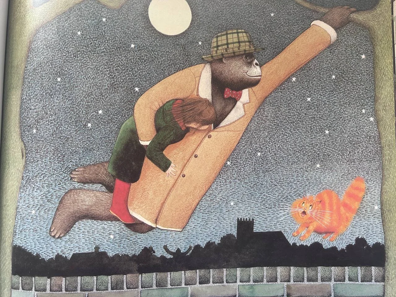
The publisher says that it is a classic story of a lonely girl, a friendly gorilla and their amazing night out. This is just a one-sentence introduction, but this book is so much more. To me, it’s not about the girl or the gorilla at all.
Anthony Browne is in my top-10 of writers. I don’t think he has ever written a bad book. My students really love him and every time we read his book the kids never want to stop.
His books are like a multilayered onion. If you are reading them with 4 year-olds, you just go through the book as you see it. Like with Gorilla, talk about what’s happening on their journey. If you are dealing with 6 year-olds, you can already start exploring the father-daughter relationship and it’s ups and downs. If your group are very knowledgeable fans of art, you will be able to smile to a few ‘gifts’ left by Anthony Browne. He leaves ‘Easter Eggs’ subtly and if you know what he means - all the better for you. If you don’t recognise references or can’t relate - it’s just fine.
Why Gorilla? Those animals are like people but not exactly. They look normal, although, if you have a closer look you will see that they are far from being just like us, there’s something iffy about them. And Anthony Browne’s illustrations look normal and ordinary unless you read between the lines. You need to LOOK not look at his pictures.
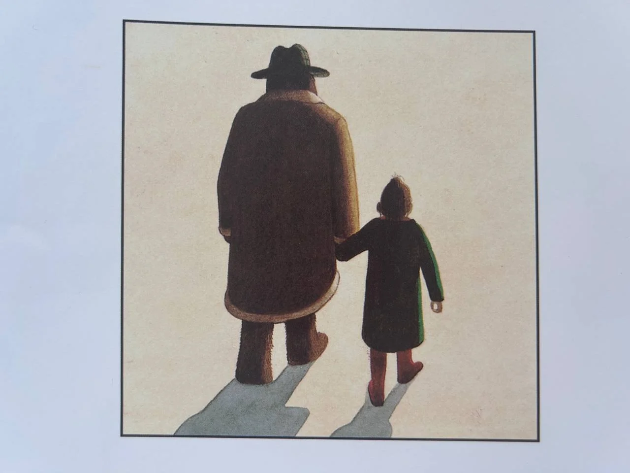
Gorillas are huge and rough. The contrast between a little fragile girl and the big beast strikes you from the very first picture. She is small and gentle not only outside but inside as well and Gorilla could easily crush her.
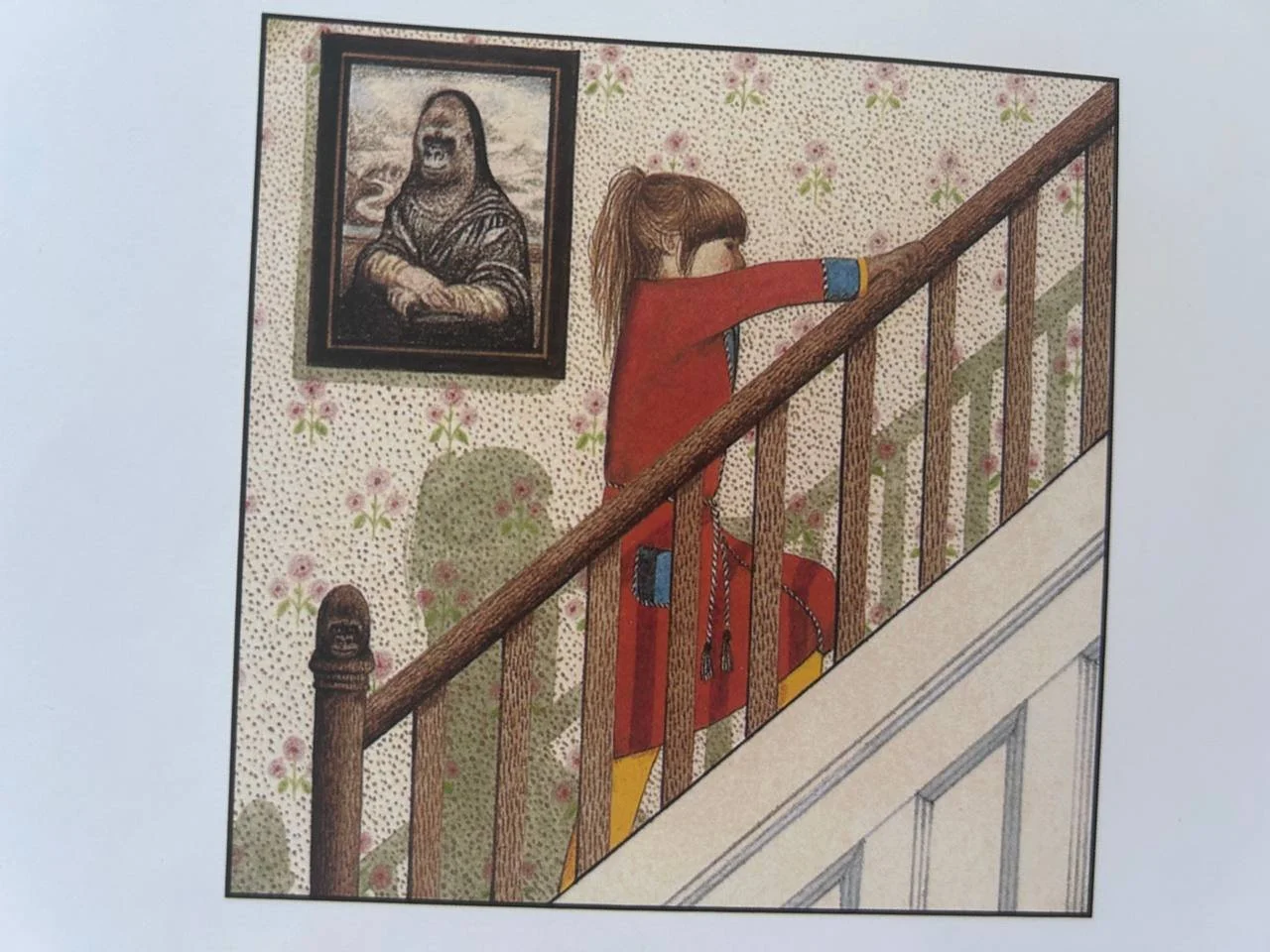
Remember I said that Browne’s illustrations look normal but they are not? See the very first picture in the book. Is it her shadow? or Gorilla’s?
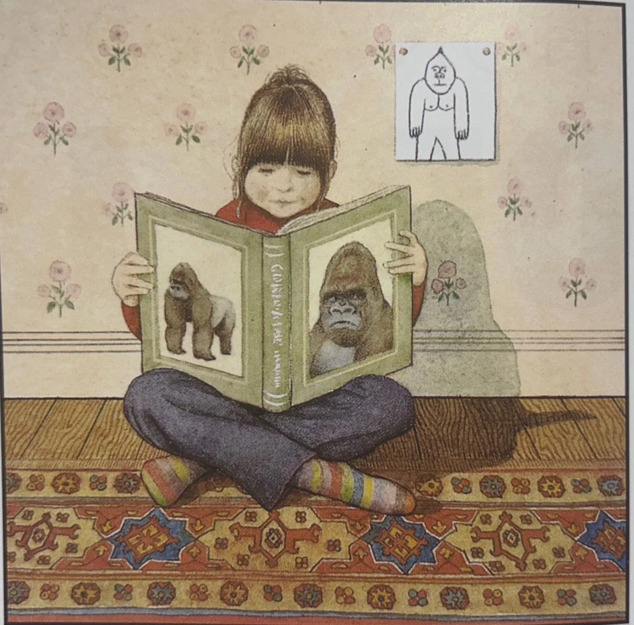
The picture on the wall behind her is watching us. It looks like it is protecting her and so is a huge book in the girl’s hands. It’s like a shield.
Let’s look at how Anthony Browne positions his characters. Hannah is placed at the very bottom of the page, her dad is above her. It makes him look more important and her small and not important.
We can’t see Hannah’s face. It makes the illustration more tense. She isn’t smiling, is she?
The table looks long and the physical distance between them marks the coldness of their relationship. Her dad is holding a newspaper and it’s another wall between them. We can’t see any food on the table and although it looks normal, but it’s not. Are they even sharing a meal?
Every little detail in this picture was placed here for a reason. The box of cereal has a picture of a monkey. Dad’s newspaper has got an article about some ape. The kitchen is impeccably clean and there’s no life in it. It doesn’t look like a kitchen of an ordinary family with a child. Everything is blue and white. Blue is often associated with the cold and sadness. The only bright patch in this picture is Hannah’s jumper. It’s warm and vibrant and I want to associate it with her warm, soft nature. Geometric shapes and straight lines also make the scene cold and her father unapproachable. He is not someone you could possibly hug. He is too cold. And he is sitting like he is on some ice-cold throne, with a fridge behind him.

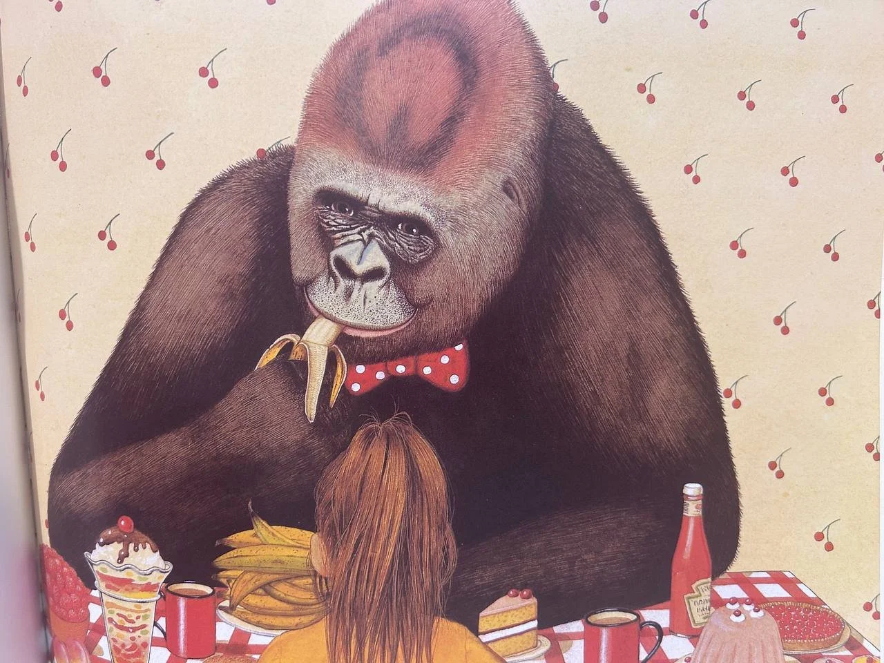
We could compare it to a similar scene but with Gorilla. Although Gorilla is big and wide, it’s positioned at the same level with the girl. See how he sits. He is hugging space around him, enveloping her into his warm embrace. The room looks fit for a little girl. Pink wallpapers with juicy cherries are just what any girl would squeak to. Their meal is more like a feast with all the exciting stuff that you are most certainly not allowed to eat in one go. The table looks shorter and now it looks very friendly and relaxed. Even the tablecloth is not immaculate and fashionable. It’s more like something you would expect to see at a picnic.
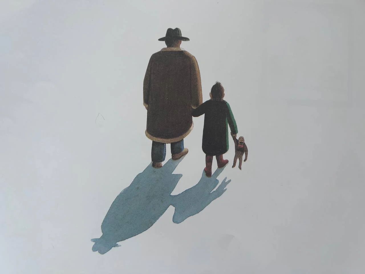
Anthony Browne uses the spot-the-difference concept throughout his work. The first picture shows Hannah walking with Gorilla. The second one is her walking with Dad. They are nearly identical but children still can spot the difference. It is not too obvious, as those pictures are far apart and children will need to remember they’ve already seen something similar. Why are they so alike though? Is it because Gorilla is wearing her dad’s clothes? Or is it because her dad is just like Gorilla: nice, gentle, loving and adventurous? Maybe he is hiding Gorilla inside him because of constant stress and workload? There is one picture where a banana is sticking out of dad’s pocket. I am very grateful, by the way, Anthony Browne creates complex characters who are neither good nor bad.
The spot-the-difference concepts support the whole Anthony Browne universe. Children love it. Every time we read his books, they say, “Mrs Gregory, we’ve seen this picture somewhere before!’ We have. And it’s good that we have got a chance to spot something familiar and talk about it. It reminds me also of films and dramas. When you see your favourite actor again and again in different films. Every good illustrator has their own style and a lot of them are very recognisable, but Anthony Browne manages to be even beyond his artistic style. He doesn’t just recycle a successful character or scene, he uses it as a reference.
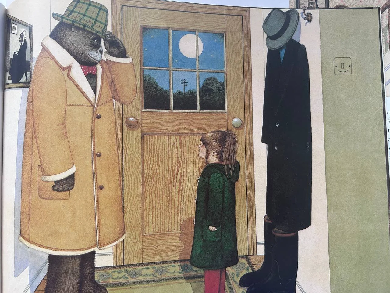
Most, if not all picturebooks, have a few transitional illustrations throughout the story. And less experienced artists sometimes leave them boring. You open the page, look at it and don’t know what to say. Everything is just obvious. The picture is important for the story, but it is transitional. Anthony Browne entertains himself and his reader leaving secret messages. It’s what I was talking about at the beginning. It’s ok if you miss them, but it’s such a pleasure to spot them. Mona Lisa and Whistler’s Mother meet on the pages of Gorilla. Have you also spotted that the banister knob looks like a monkey’s head. And on the second picture a gorilla is peeping inside the house. There’s a also a little nugget smiling from the wall.
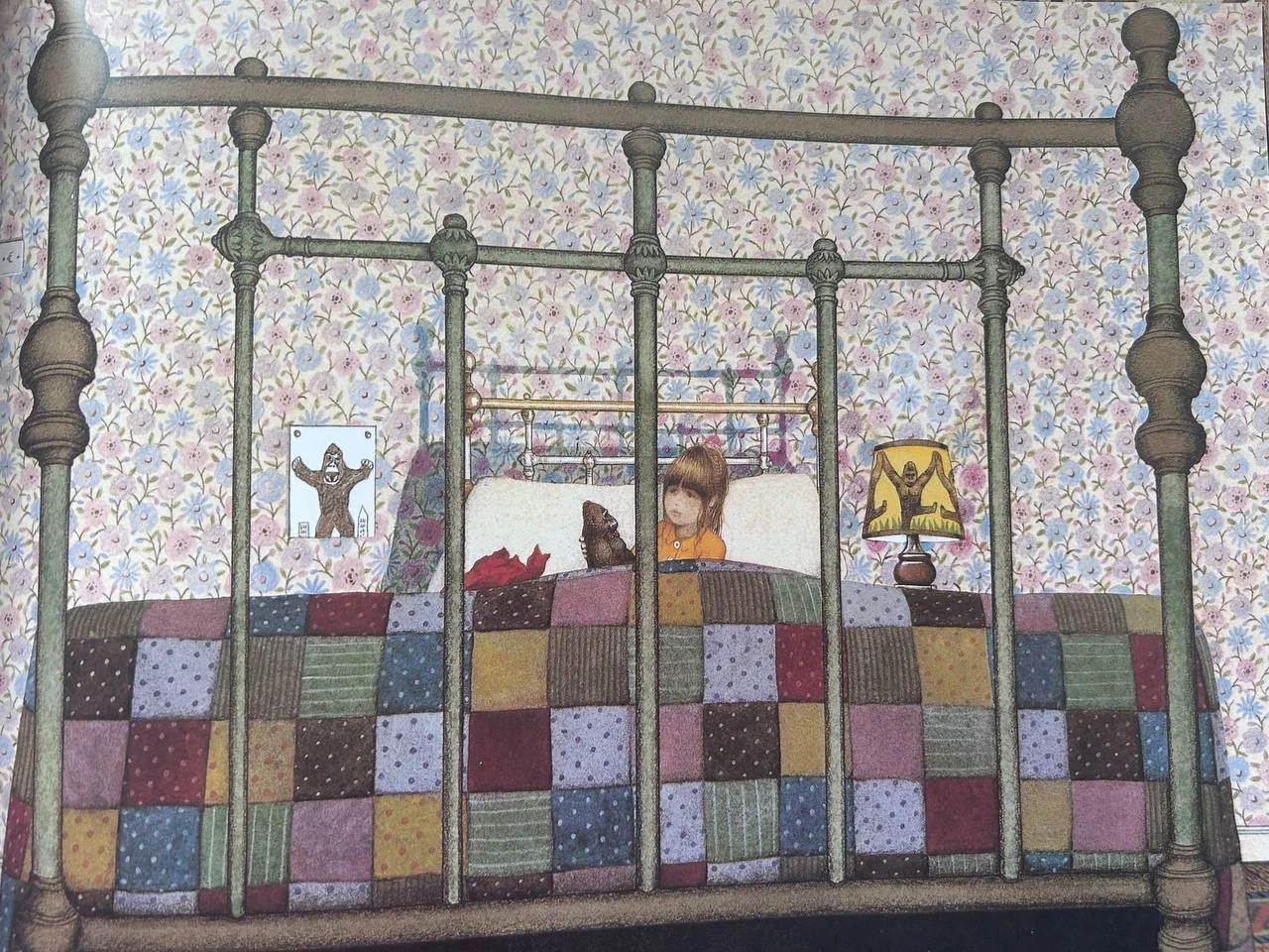
I want to finish today with my favourite illustration in this book. Perspective is so important and meaningful. Because of the angle the bed looks so much bigger than it actually is and now Hannah is tiny and not important. A metal bed frame is cold and unfriendly. The shadow on the wall makes it look like a cage. The girl is trapped. She is imprisoned and lonely.